What the Early Web Got Right About Simplicity
The early web worked because it did fewer things, and it did those things well: deliver readable content quickly and let people link to it. That sounds basic, but it’s a powerful design constraint. When you design tools, automations, or business systems with the same constraints—clarity, speed, usefulness—you get products people actually use.
This post pulls practical lessons from the early web and shows how to apply them to modern tools, AI-assisted workflows, and business systems.
The core early-web lessons (in plain terms)
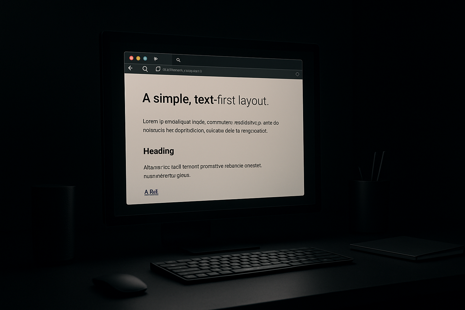
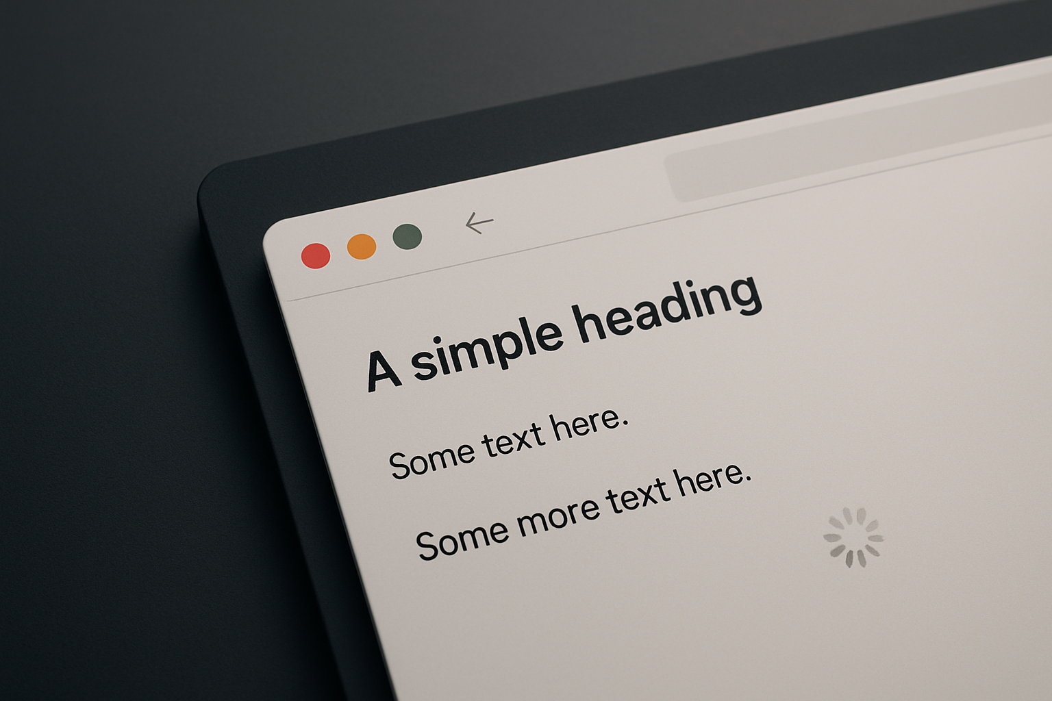
- Clarity first: pages were mostly text, with clear headings and links. No one guessed where things were.
- Fast by default: small files, little JavaScript. Pages loaded quickly even on slow connections.
- Usefulness over feature lists: simple publishing + hyperlinks solved real problems.
- Composable pieces: pages and links could be assembled into new flows without special permission.
- Resilient fallbacks: if your browser couldn't do something, the content was still reachable.
These are not nostalgic points — they’re engineering and product rules that scale.
How these map to modern systems
- Clarity → explicit affordances and predictable navigation (what can I do here?)
- Speed → optimize for first meaningful paint, mobile performance, and latency in automations
- Usefulness → ship the smallest feature that solves the user’s core problem
- Composability → provide clean inputs/outputs (APIs, webhooks, CSV) rather than locking users in
- Resilience → design for errors, offline, and graceful degradation
Practical design patterns to borrow from the early web
Focused entry points
- Make the default screen solve one primary use case. Everything else is secondary.
- Example: a dashboard that opens to the most common action, with other functions reachable but not competing.
Clear, linkable states
- Every important state should have a URL or identifier you can share or automate against.
- This makes debugging, documentation, and integrations easier.
Fast feedback loops
- Prefer quick, incremental results over long blocking processes. Give progress indicators and partial outputs.
Minimal onboarding
- Document the 3 things a user needs to do first. Let advanced features live in menus, not the landing view.
Explicit defaults and sane fallbacks
- Choose defaults that match most users. When external services fail, fall back to cached or simplified behavior.
Compose, don’t copy
- Offer small, well-documented building blocks (APIs, exports, templates) so users can create their own workflows.
Applying simplicity to automation and AI-assisted workflows
- Start with intent: ask what outcome the automation should guarantee, not which bells and whistles to attach.
- Keep the human in the loop where decisions matter. Automate repetitive steps; surface the decisions.
- Make actions reversible or auditable. A simple rollback is better than an opaque optimization.
- Use small, tested building blocks rather than one monolithic agent. Chains of simple tools are easier to reason about.
A short audit you can run in an afternoon
- Identify the primary task for three core screens or flows.
- Remove everything that doesn’t support those tasks; test with a teammate.
- Measure load time and first interaction: is the useful content visible within a couple of seconds on mobile?
- Check shareability: can you link to the important states or export the data?
- Simulate failure: what happens if an API or third-party service is slow or down?
- Document the three steps a new user needs to succeed and put them where users will see them.

Tech-history reminders that matter for engineers and product teams
- Simple standards win: the web succeeded through small, well-understood protocols. Prefer standard formats (JSON, CSV, plain HTML) for interchange.
- UX is not visual polish alone: it’s information clarity, predictable behavior, and small cognitive load.
- Speed compounds: shaving milliseconds from common paths improves top-line usage more than adding new features.
Short checklist to act on today
- Trim one nonessential element from your main screen.
- Ensure a shareable URL or export from one key flow.
- Add a progress indicator to a slow task.
- Write a one-paragraph explanation of the primary use case and surface it in-app.
Practical takeaway: simplify the path to the user's goal—clear affordances, fast responses, and useful defaults beat feature bloat every time.